The Essential Checklist for Much Higher-Converting Checkouts
Last updated |
Today I’m excited to bring you an excellent ecommerce checkout article from a seasoned conversion and usability pro – Mark Hall.
One thing has become obvious to me in the eight years I’ve spent researching and designing eCommerce site checkouts: many checkouts today are still doing a poor job of convincing visitors to click the “place order” button. While there will always be many shoppers who are just curious ‘tire kickers’, the tragic fact still remains that many checkout bailouts are by people who had fully intended to purchase, but for some reason didn’t feel confident enough to pull the trigger.
During this time I have learned many things to ensure a higher percentage of visitors get through website checkouts and pull the trigger. I’ve decided to help you by turning these learnings into a ‘test-proven’ essential checklist for higher-converting checkout.
Many of these can significantly grow revenues, like at an auto-part seller where I increased“add to carts” by 2%, translating to a yearly revenue boost of $3M! This is not an isolated case; you can realize similar results for your site by trying these test-proven techniques. Let’s get started with the 10 essential techniques:
10. Consistently Expose Your Value Propositions
My experience moderating dozens of Category > Product > Checkout usability test sessions (and seeing changes top brands have made to their checkouts) has convinced me that your core value propositions need to be shared visibly and repeatedly during the purchase process. And “sidebar” exposure is not enough; to ensure most of your prospects notice and internalize your selling points, your value props need to appear in the user’s main scan path.
Keep in mind that the purchase experience actually starts on the Product page, where the prospect is engaged enough to peruse images and details before adding the item to their cart. So you should start exposing your propositions at this point in the experience, if not before (on Category pages). Don’t feel that you need to make your value prop copy or graphics dark grey or colored; mid-grey tones are sufficient to be noticed, yet won’t distract from the primary interaction elements on the page.
Another point: Don’t rely solely on page footer exposure. My experience and click heat maps show that most users don’t scroll past the “false bottom” of the page (typically just below the product details and any applicable customer reviews). Place your key selling points in one of the main columns to ensure that they’re seen and tilt the benefits/objections scale in your favor.
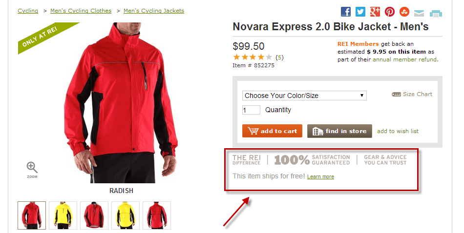
Here are examples screenshots from the REI.com checkout, who do an exceptional job of communicating value proposition:
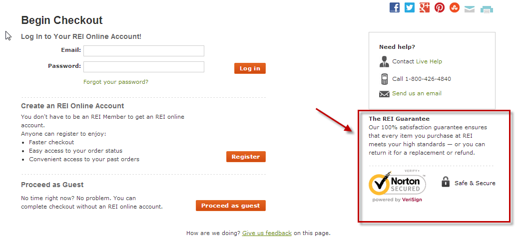
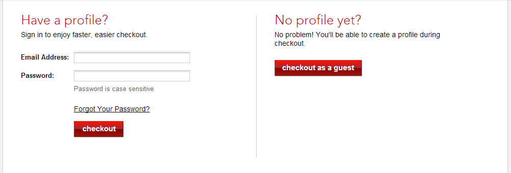
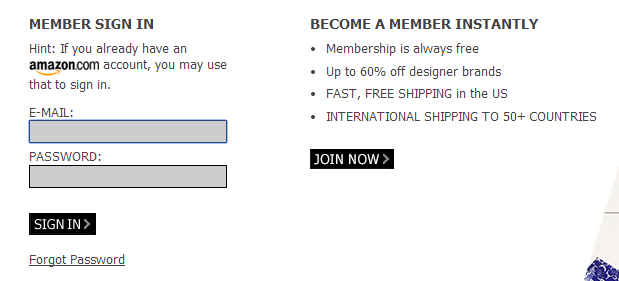
9. Don’t Require Registration During Checkout
A case study from a leading conversion optimization agency, whose team has done extensive testing of checkout flows, confirmed the suspicion I’ve had for years: requiring registration during checkout is a conversion killer, so be very wary of doing this. Remember, your first goal during checkout is to get your prospect to buy now, not necessarily to make it easier for her to make a later purchase. So make account creation during checkout optional or, better yet, don’t present this option until a later time, such as on the order confirmation page or in a separate marketing email.
What about “member only” sites like dollarshaveclub.com and myhabit.com, you may ask? Well, these companies are exceptions to the rule since they have made a very conscious decision to require membership in order to do business with them by making it a key part of their value proposition (you must become a member to get their special pricing).
Great examples of this below show how Macys.com allows visitors to checkout as a guest, and how MyHabit.com makes joining easy for existing Amazon.com members.
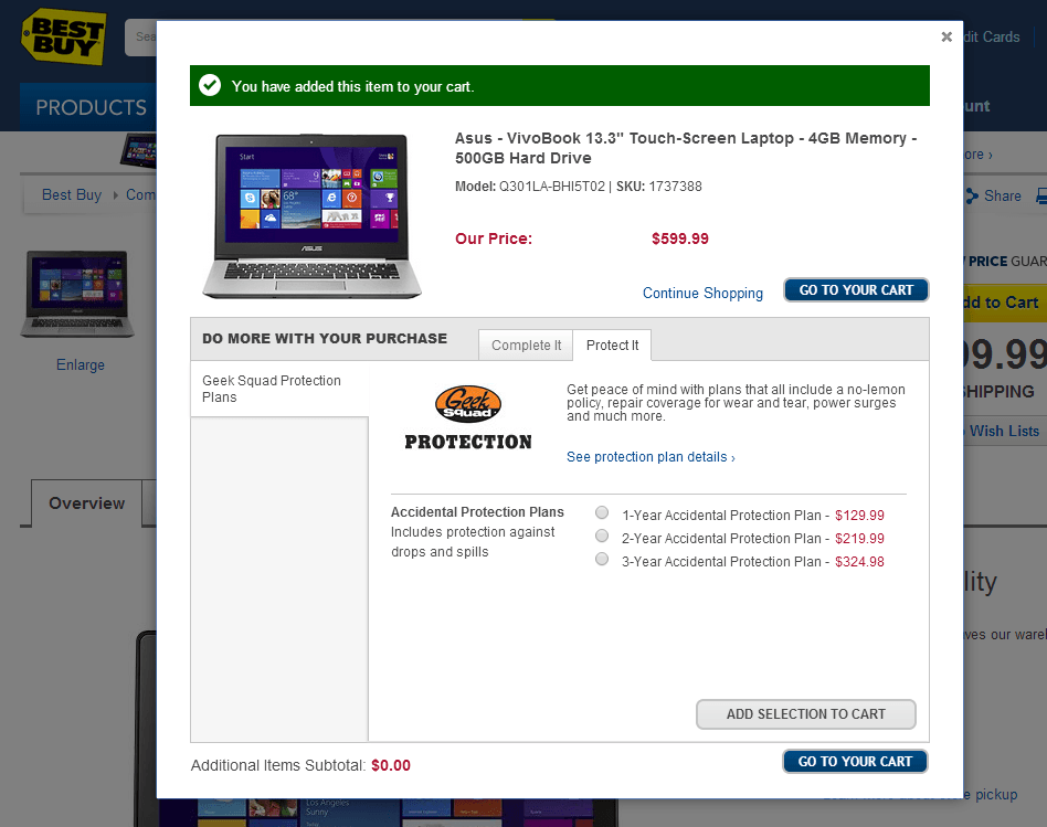
8. Cross Sell At The Right Place And Time
I recently asked five seasoned eCommerce Directors for major brands “Where’s the best place to cross sell (offering complementary, relatively low-priced items)?” Based on testing they had done, the consensus was that these items should be offered “as close as possible to the user’s decision point” – i.e. either on the “added to cart” layer, or in the cart. After that point, most prospects have “mentally checked out.”
Also, you should present cross-sells only if you have integrated a recommendations engine (Certona, Monetate etc.) or your sales team has the insights to know which items pair best with each of your top selling “parent” products. Showing no recommendations is better than showing bad ones, since bad recommendations can compromise trust in your brand.
If you believe, as many marketers do, that repetition and persistence sells, and decide to ask for a cross-sell again later in checkout, be sure not to offer the item(s) more than twice, as the annoyance factor may outweigh the increased order value advantages. Here is a good example of a well-timed, relevant upsell on the bestbuy.com checkout.
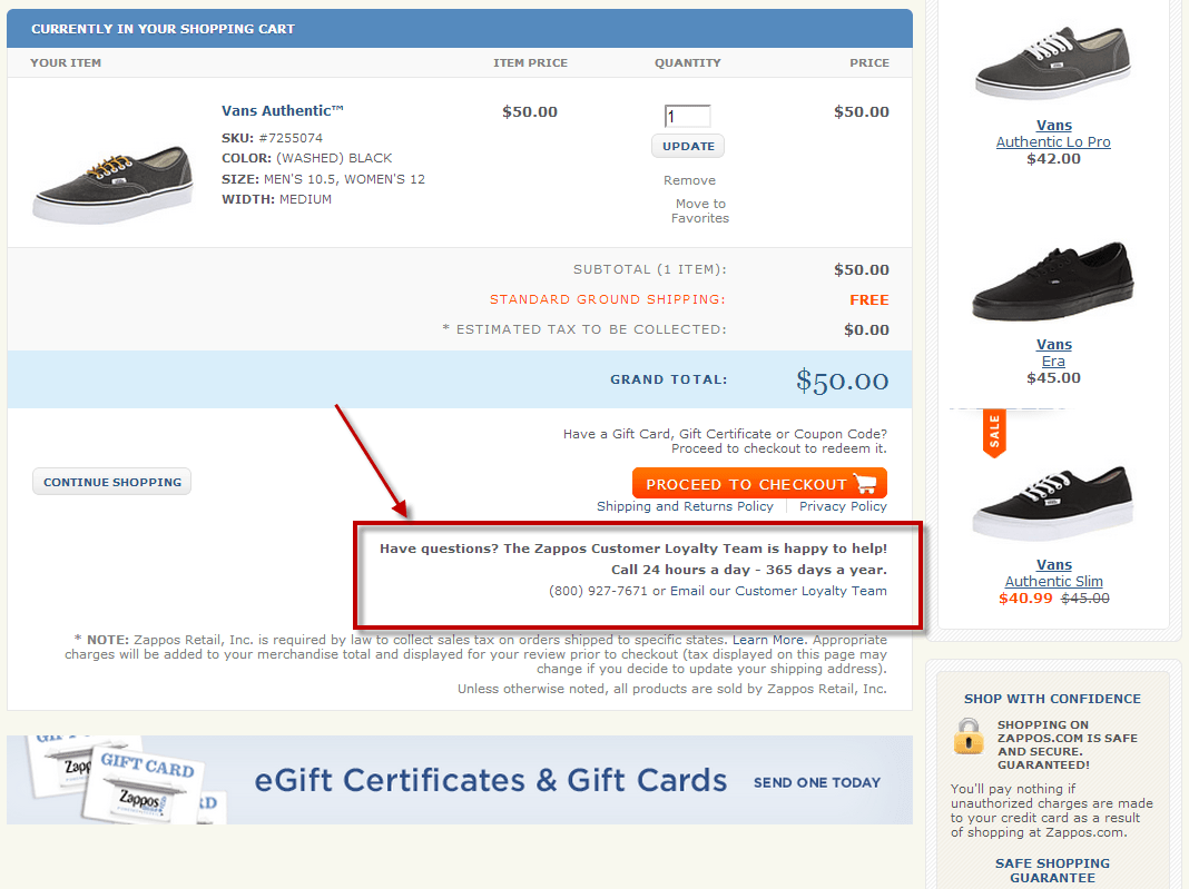
7. Offer Help Throughout The Checkout Process
While providing global (header) access to customer support is fine on other pages, during checkout you need to be proactive about offering user assistance. This means placing phone numbers and chat links on every page of checkout, and in a clearly visible location (the user’s main scan path). Here is a good example of this on the Zappos.com checkout page:
This does not mean always including pushing a chat window/layer to your users after a set period of time on the page (e.g., 15 seconds). In fact, when I recently did a user test for an auto parts seller that had this feature activated, nearly all of the participants found it annoying. Their post-test comments indicated they didn’t want help to “jump out” at them; they just wanted to know where to find help if and when a question or concern did arise.
6. Create Some Purchase Urgency
A key tipping point in the purchase decision is clearly the cart, and specifically the “start checkout” action. As a result, you need to be sure to address all common concerns and objections at this time to “tip the conversion scale” in favor of buying now versus maybe coming back later. In most cases you can create such urgency by:
- Emphasizing delivery speed (“In stock; receive by Feb 28th if ordered today”)
- Creating scarcity (“Only 3 of this item remaining”)
- Presenting a limited-time offer (“Offer expires February 28th”)
If there is any way to make the prospect feel she will be “missing out” – or the price will go up – if she does not buy here and now, consider mentioning that as well. This copy should be especially compelling to prospects who often need your product ASAP, and thus would prefer not to do more comparison shopping.
Just like your value propositions, it’s best to start exposing these urgency triggers earlier in the process (Product and Category pages), then to reinforce the factors throughout the checkout process. Here is a good example of the Macys.com checkout doing this well:
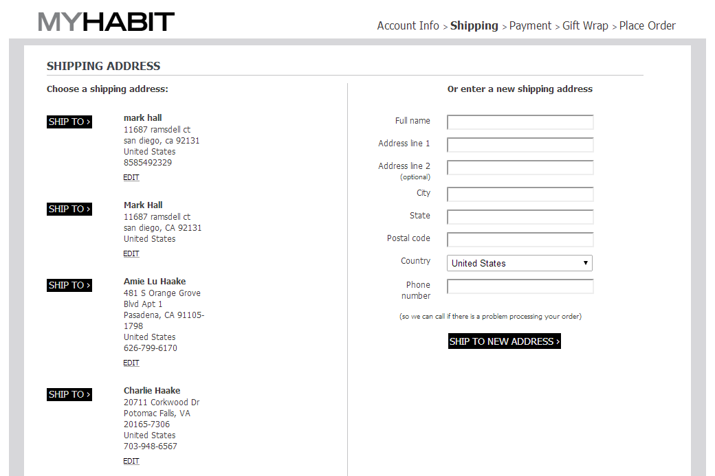
5. Remove Header Navigation During Checkout
Admit it – the U.S. has become an attention deficit nation. While some of us actually have an attention-deficit disorder, the rest of us are bombarded with so many messages and choices that we can easily lose our focus when surfing the Web. One minute you’re researching background for your term paper; the next minute you’re watching cats twerking on YouTube.
In order to decrease distractions that can cause users to bail out at the most inopportune time, you should remove all unnecessary distractions during the checkout process. This is not the time to actively seek social validation (Facebook likes, Twitter followers). It’s also not a good time to invite your prospect to continue shopping (except, perhaps, to consider a couple highly relevant cross-sells).
To minimize distractions and the revenue bleeding they cause, I recommend that during checkout you:
- Remove all global navigation from the header
- Remove all highly visible social media icons
MyHabit employs this “less navigation is more” philosophy during checkout:
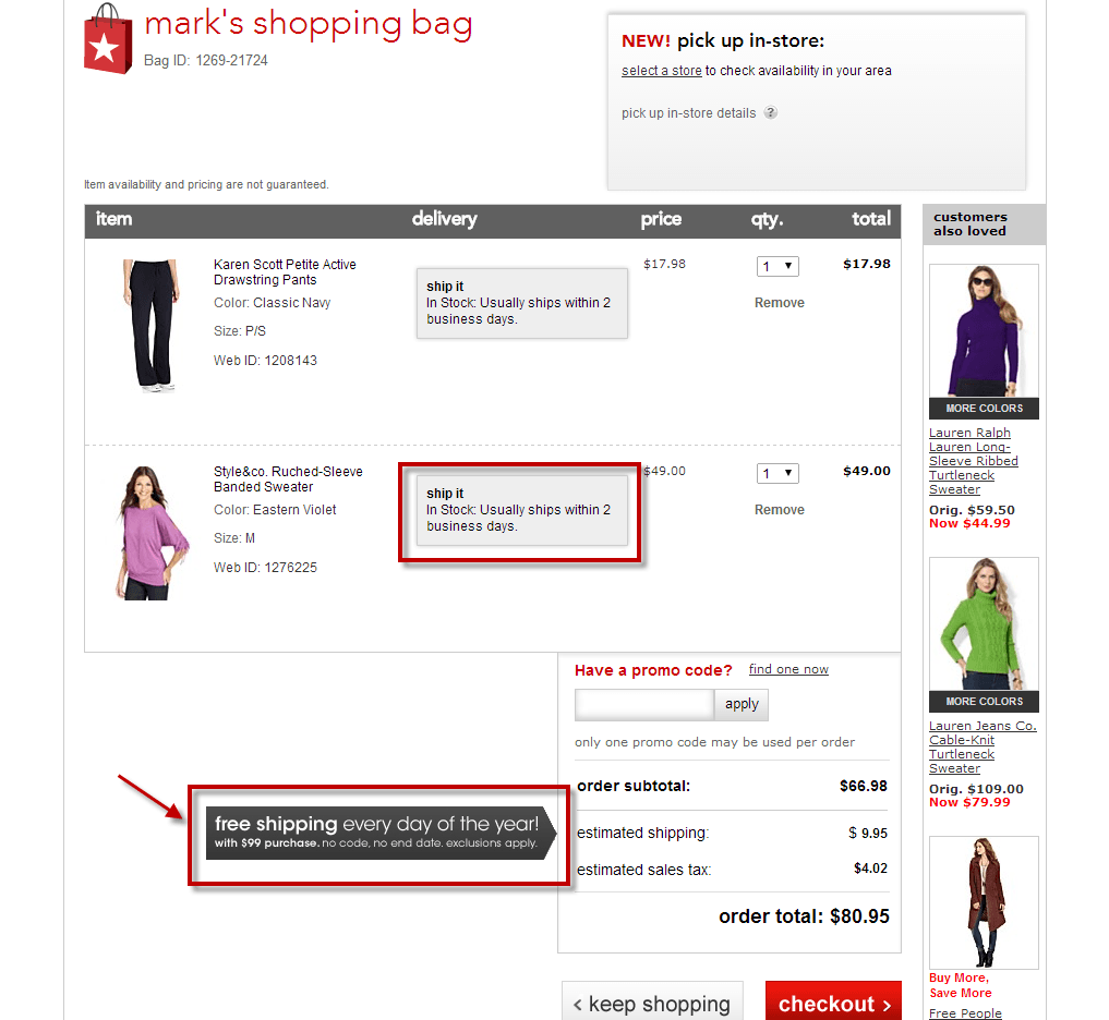
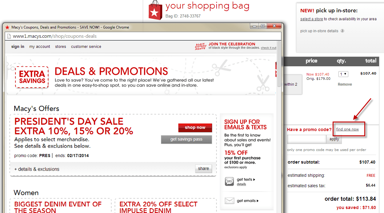
4. Reassure the Prospect That The Price Is Right
If your prospect has added an item to their cart based on a referral from a coupon code (e.g., email) or price optimization tool (e.g., Runa), you don’t need to offer them a lower price incentive. Your marketing efforts to this point have already pushed this person over their “price concerning hurdle.”
If your prospect hasn’t seen a promotional offer (and one applies), it’s OK to include a “Promo Code” field in your cart. But if you do include this field you also need to provide the answer to the “Am I getting the best deal?” question that will likely arise in the prospect’s mind. Macys.com does this by including a “find one now” link that, when clicked, brings up a new window showing all applicable promotional codes, along with the ability to “apply to my order.” If no promos apply for any items in the cart, you should suppress the display of the code entry box and use other strategies to ensure that your pricing is competitive.
By implementing this logic, you’ll avoid giving away your precious margins to prospects who either don’t expect – or aren’t willing to expend the extra effort – to get the lowest price.
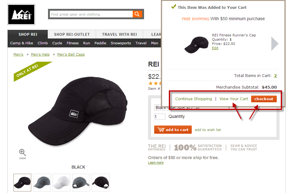
3. In Some Scenarios, Try Bypassing the Cart Page
(Note: The following assumes that in your checkout process the prospect can select their shipping option somewhere besides the cart, or you can easily move these options to a later step in the process.)
Why must all checkout roads go through the Cart page? In many scenarios (e.g., you sell only one product, your average number of products per order is less than two, or you have implemented an “item added to cart” layer), your prospect has a clear mental image of what she’s buying, so it makes sense to test skipping the Cart page and taking her directly to the Shipping/Billing/Payment step.
If you have concerns about skipping the cart entirely, you can hedge this by testing a “continue shopping | view cart | start checkout” branch, as shown in the below REI.com example.
The “less is more” principle applies here: giving the user one less chance to view and reconsider their purchase decision might just improve your conversion rate.
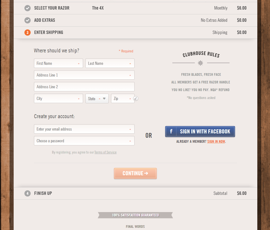
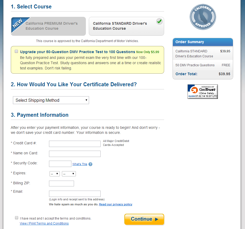
2. Implement a One-Page Checkout
While I have designed several multi-page checkouts, given the advent of slick Ajax form interactions like expand and collapse controls, and background page refreshes, their cons now outweigh their pros in most cases. So I’m a strong advocate of keeping all of your checkout steps on a single page.
This does not mean, however, that you should omit the steps in the process. It’s a good idea to reinforce them, especially if you decide to use an “accordion” model (expanding/collapsing steps, as shown below for DollarShaveClub.com), since this parses the user’s reading and data entry into more intuitive “chunks”.
So, should you still have a separate “review order” page? Most often, No. I’ve tested two checkout designs with and without these pages and in both cases the “without” versions won. While you may be concerned (as I have been) that omitting this step will cause some users apprehension and/or lead to some “accidental orders,” based on my discussions with Customer Service managers this is rarely the case. The vast majority of users who get to this final step fully expect their order to be processed after entering their payment information. For this majority of your prospects exposing this extra step could cause some pause – the last thing you want to happen at this late juncture in the checkout process.
1: Think Outside of The Testing Box
Lastly, always try to think of more unusual checkout tests – you never know what will work well for increasing orders on your website (but maybe not work on another).
One of the most surprising findings to me over the past two years is this: a client of mine achieved a 5% checkout conversion lift simply by increasing the default font size on all of its checkout pages (see example below). Not a bad for a change that required no development effort, just a quick CSS update and server refresh.
Too often, designers use font sizes simply too small for a significant percentage of visitors to easily read. Of course sizes will vary widely based on screen resolution, but a good guideline is to use a “body” font that is 14-point or larger if a significant percentage of your site’s users are over 40 or may have vision impairments (and 12% of the population, or 1 in every 8 adults, has some kind of vision impairment).
“But that’s too big – it will mess up my layout!” you may say about this unusual test. Actually, you’ll find that it won’t if you have a responsive design that adapts well. Don’t worry about your users having to do a bit more scrolling during checkout; this is not the conversion detriment it is for sales pages.
Wrap Up: Higher Checkout Conversion Is In Your Future
Don’t continue leaving thousands – if not millions – of dollars in yearly revenues on the table due to a poor checkout experience. Reduce the guesswork involved (and those endless design debates) by testing trying one of the checklist items I have covered.
Be pragmatic; start with the techniques that require the least development time, test variations and measure the conversion, revenue and average order value (AOV) lifts. The most important thing is to get some design variations and tests started ASAP so that you can learn which give you the highest revenue improvements.
Now some questions for you to consider and chime in on:
- Which of these techniques do you think makes the most sense to try given your business model and prospects?
- How soon can you convince your organization to prioritize, implement, test and profit from these improvements?
About Mark Hall
Mark is the Principal Conversion Architect at Hallmark Experience and has been researching, designing and testing user experiences for over 15 years. He’s had the privilege to work with top brands like Macys, Kaiser Permanente and American Express, as well as several smaller, fast-growing eCommerce companies in the San Diego area. You can reach him here.